ON Running is a Swiss sports brand renowned for its innovative footwear designed to enhance the running experience.
Their values are deeply embedded in their commitment to performance, innovation, and sustainability. ON Running integrates eco-friendly materials and processes into their products, ensuring a smaller environmental footprint without compromising on quality or performance.
Embracing a holistic approach to running, ON Running creates a community that celebrates diversity, perseverance, and passion for the sport. Through their products and initiatives, they inspire individuals to push their limits and experience the joy of running like never before.
Nothing Creator Playground is a modular creation system designed for rapid experimentation and scalable output. It equips creators with reusable assets, configurable templates, and collaborative workflows to streamline production while maintaining creative flexibility. Built for iteration and consistency, the Playground enables distinctive Nothing-led content across formats and platforms.
Created in collaboration with the Nothing creative team, the UI interface explainer uses dynamic motion to guide the user experience, seamlessly oscillating between micro-interactions and macro layouts with slick, purposeful transitions.
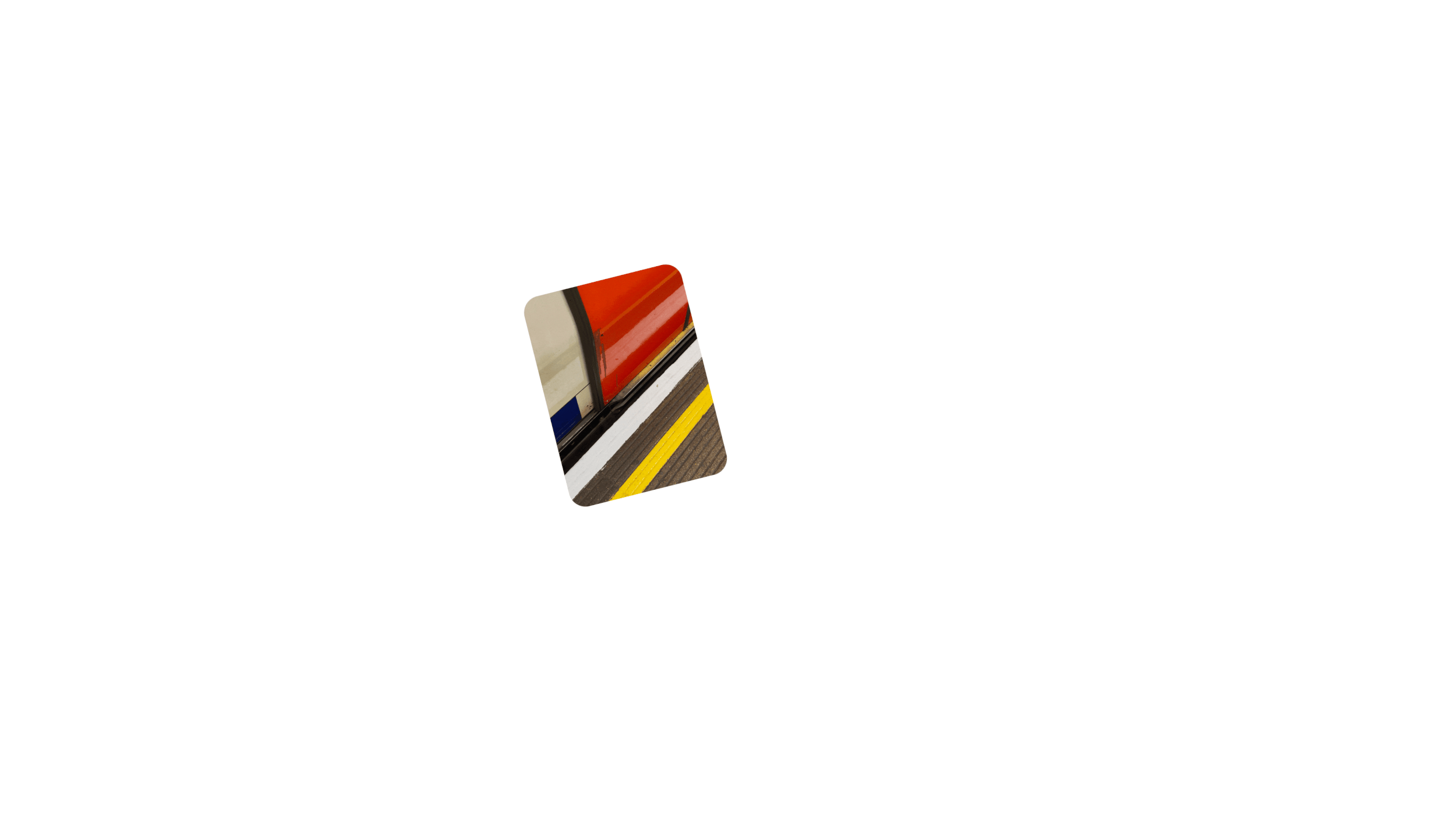
Sofascore, a sports analytics app with 20+ sports, 5000+ leagues and tournaments, millions of events and many esports competitions. An app to empower each new generation of fans, athletes, analysts and die-hards.
Working with Design Studio we developed the motion principles for the brand. Custom typeface ‘Sofascore Sans’ was created by Hot Type.
Working as a motion designer at branding agency ZAG we created the motion guidelines for EE's biggest brand launch in over a decade.
From R&D to final delivery, we developed the motion design system for the brand to use as a basis for their massive marketing ecosystem.
The Project took the brand back to its core component, the smart dot, and gave it a new, simpler aesthetic and defined new behaviours to allow the brand as much playful, multi-channel utility as possible.
Introducing the launch of "The New Ear (a)" a revolutionary departure from the conventional tech-centric releases of our time. In a world saturated with gadgets and gizmos, "The New Ear (a)" offers a bold alternative - a celebration of the power of silence and introspection.
The project consisted of collaborating with Nothing (R) and creative studio The Beach Assembly, working on the initial type animation style and R&D development.
Motion type was used in the main launch promo, social posts as well the official launch in Tokyo. Final edit was put together by The Beach Assembly.
Ongoing collaboration W/ Accept & Proceed for Nike’s Retail Experience Design Team.
Collaborating with Nike to take over the entire Arena throughout their multiple store spaces, with bespoke motion content combined with existing campaign footage to create unique digital outputs for each project.
In 2022, BT Group launched a bold rebrand in collaboration with ZAG, repositioning itself as a modern, corporate parent brand to its sub-brands BT, EE, and Openreach. The new identity stepped away from the consumer-facing legacy of BT, focusing instead on clarity, structure, and future-focused cohesion across the wider organization.
Working in a freelance capacity with ZAG, we were tasked with crafting the brand’s motion DNA, bringing life and meaning to the visual identity through movement. Rooted in the brand’s three core values, Build, Connect & Flow, we developed a motion system driven by the spectrum colour bar.
Blocks of colour animate into place to ‘build’ the brand, seamlessly transitioning and interlocking to represent connection and continuous flow. The motion language embodies the diversity and complexity of the BT Group while ensuring a consistent and elevated brand experience across all touchpoints.
Working in collaboration with the Nothing(R) design team. A story of colour, told through our most powerfully unique smartphone yet.
Phone (2a) Special Edition celebrates primary colours and their place within Nothing’s brand identity. This new smartphone is the first time that all three colours have been used in one piece of Nothing hardware.
The University of Oxford set out to do something unprecedented: a £185m centre uniting seven humanities faculties, world-leading research institutes, a new Bodleian Library and a public cultural programme.
The challenge was to articulate a fundamental shift — from the humanities as an academic silo to a living, experience-led cultural presence.
The Centre wasn’t about presenting finished culture. It was about creating the conditions for culture to emerge — shaped by participation, evolving in real time.
This became the brand idea: Culture in Creation — a living identity that grows with its audiences and builds momentum over time.
Working in collaboration with True North, who developed the core brand identity, a bespoke motion system was developed to bring the brand to life.
It translates brand principles into motion behaviours, defining timing, transitions and compositional rules for a cohesive, scalable expression across digital and motion-led touchpoints.
G&S Vastgoed is one of the leading real estate developers in the Netherlands, with a reputation for progressive, sustainable and iconic landmarks, particularly in the Zuidas district of Amsterdam.
A collaboration with The Stone Twins to bring motion to the new name and brand identity for the consolidated company.
Partnering with The Stone Twins in a freelance role, we contributed to the motion identity of Het Muntgebouw – the former Royal Dutch Mint (Koninklijke Nederlandse Munt) – now beautifully redeveloped as a mixed-use hub of work, culture, and leisure.
The design approach draws from Het Muntgebouw’s rich heritage and the skilled craftsmanship behind its restoration, while embodying the building’s renewed spirit and ambition. For example, the logo features typography inspired by the Juliana Guilder coin series by Ludwig Oswald Wenckebach, minted in the millions within this monumental building. The small icons pay homage to ‘mint marks’ and can be adapted for different themes or messaging.
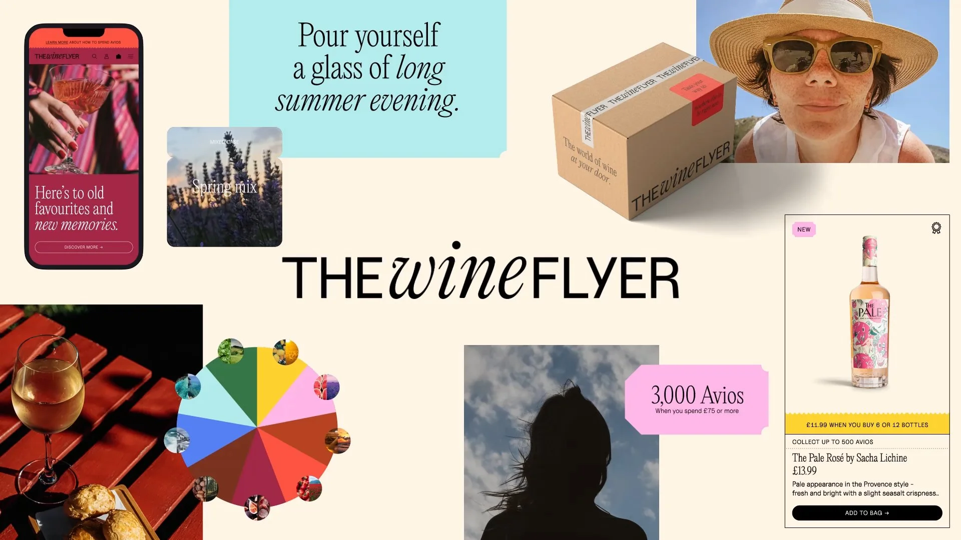
The Wine Flyer is the first of its kind – an e-commerce platform opening up a completely new way to spend and collect Avios on purchases beyond travel. While their rapid launch achieved great market traction, their identity at inception wasn't a true reflection of their unique perspective on wine industry and was limiting their business growth in a saturated market.
Studioone.one developed a split-screen visual system that creates a bold and clear voice in the market - that it's never just about wine but the perfect match of the wine and the moment.
We created the motion visual system to capture the rich and evocative world of taste and place - warm, inviting colours paired with images of collected memories, both at home and away. Crisp product photography paired with a subtle travel-inspired graphic language.
Unlock potential.
Working W/ Form brand studio to develop the brand motion system.
The new brand identity was created using code language, building on the central strategic insight around the speed and quality of data being ‘unlocked’. The brand symbol is a combination of brackets and slashes to create the M and V. This concept was applied right across the brand identity, in a variety of ways to express the idea.
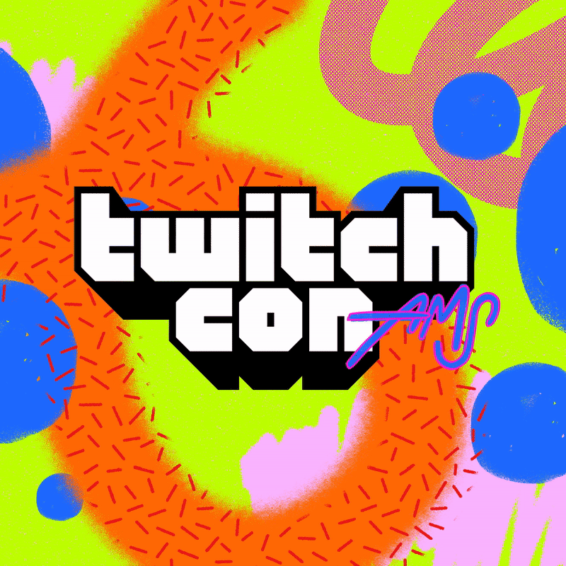
TwitchCon is a live streaming convention organized by /Twitch that focuses on the culture of live-streaming and the video gaming industry.
Working with the /twitch creative team we worked on developing the pre-existing branding, breathing life into it with motion across all venue digital spaces and socials.
A gallery of people, for people.
National Portrait Gallery tells the story of Britain through portraits, using art to bring history to life and explore living today. From local champions to global icons, national treasures to unsung heroes, the Collection is filled with the surprising and inspiring stories that have shaped, and continue to shape a nation.
Working with Edit Brand Studio, the new National Portrait Gallery identity needed help to give the gallery more presence, more reach, and more relevance.
The identity is rooted in the Gallery’s rich visual heritage but reimagined for the needs of a 21st-century brand.
Coca-Cola 'Real Magic' Global Campaign and Brand Identity.
The refreshed Coca-Cola identity, playfully dubbed the ‘hug’ logo, introduces a wraparound visual system inspired by the brand’s iconic packaging across cans and bottles. Its fluid, embracing form creates a sense of connection and movement, reflecting Coca-Cola’s new global positioning.
This evolution coincides with the launch of the brand’s first tagline update in five years: Real Magic. Building on the heritage of It’s the Real Thing, the new messaging emphasizes human connection and togetherness, resonating in today’s complex and challenging times.
Collaborating with KnownUnknown and a network of global creative talent, we contributed across disciplines—art direction, motion, and visual storytelling—to bring the Real Magic vision to life, ensuring the identity feels dynamic, flexible, and emotionally engaging across every touchpoint.
Working with brud.creative to launch a new life style brand in collaboration with Jackie Chan. Offering physical products and web 3 experiences. The brand is part of the wider ‘Kungfuverse’ platform, and sets out to engage fans from the next generation and celebrate Jackie's enduring legacy while charting a bold new direction for its future.
We helped develop motion principals and kinetic arangements that captured the movement of Kungfu. Building on motion tracking of vintage training footage to bring back to life long-lost moves and convert them into a unique set of motion and static graphics.
Brand Design & Concept: @brud.creative
Motion: @calango @orderdesignuk
Graphics: @matthodges @octopusjellysquid
Client: @kungfuverse @jackiechan @sonjachen
Typeface: Coign Pro Bold @colophonfoundry
Type in Motion.
Co-Type Foundry
Ambit, Coanda, Aeonik Mono, RM Neue
Type Department
Faust, Evangelion, Molen, Manera
Displaay
Roobert Regular
Superior Type
Restart Hard, Restart Hard,
Recent digital display branding for Gymshark at the launch of their 18,000 Sq ft flagship Regent Street store, in London.
When the Gymshark store opened, they wanted to switch gears in how they presented written messages. Static wasn’t going to cut it on one of the largest window screens on Regent St - one of the busiest streets in Europe.
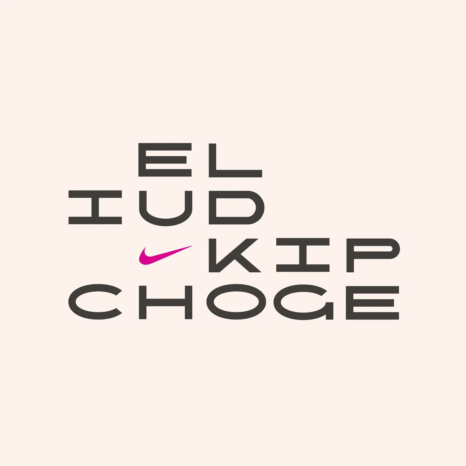
Breaking the two-hour marathon redefined running.
Eliud Kipchoge's achievement combined cutting-edge science with unwavering passion and commitment, proving that belief in an impossible goal is at the core of human potential.
By placing innovation and performance at the forefront, our campaign unites and inspires the next generation of athletes.
Collaboration with design studio Filthy Media
PYNRS champions community, culture, and diversity through technical running apparel using streetwear design concepts and high performance fabrics made from recycled materials.
It’s all about connection. Born out of community, the brand draws inspiration from what brings us together. Performance streetwear is the embodiment of that notion.
Collaboration W/ Noance Studio
Zion1.Zoom.Air.
Conceptual branding concepts.
In creating the Zion 1, the Jordan brand was taken by Williamson’s unique blend of star power. They looked to design a silhouette that both enabled his immense physical tools on the court while also illustrating personal traits that make him a superstar.
Conceptual motion branding for Nike Air Max 270.
Predator Mutator 20.1
Find your unfair advantage.
Conceptual collaborative digital + print branding project with Will Lyddon.
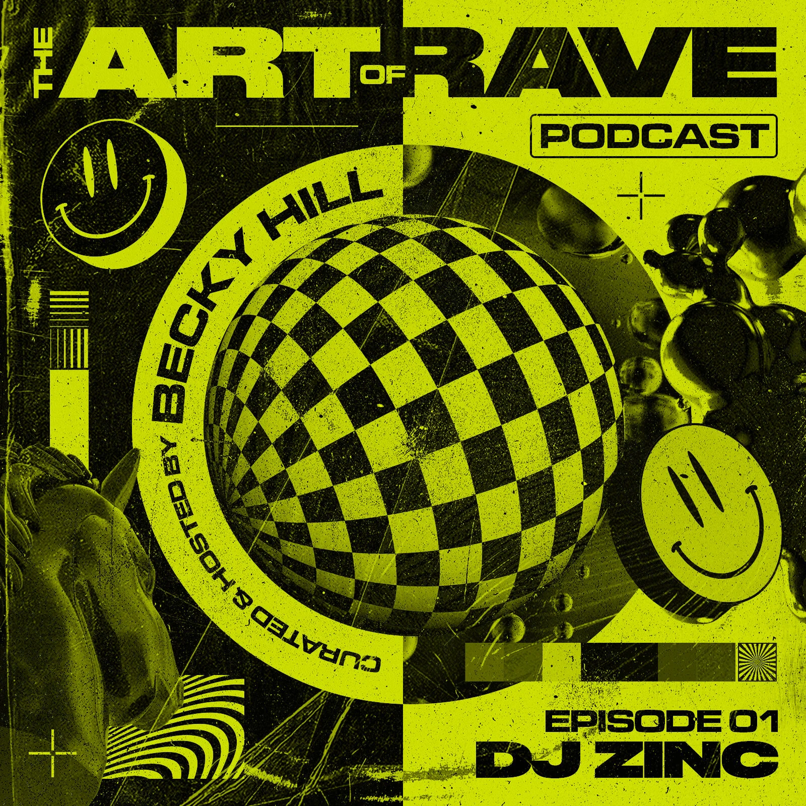
The Art of Rave podcast series, hosted and curated by singer-songwriter Becky Hill. The Podcast featured the likes of DJ Zinc, Andy C and Roni Size discussing and sharing their rave culture experiences.
The branding takes the sense of early 90’s rave art, bold brash type and imagery with a duotone colour palette, indicative of the era.
As part of our ongoing work with Concrete, we developed the new branding visuals for Coventry’s electronic music festival. Set around the city’s road network, the campaign matched materials and concrete forms integrated with vibrant colours.
The graphic outcomes were applied across online & street advertising as well as promotional videos and animations.
Rebranding for Plymouth’s premier Bass events brand. Abstract brutalist approach with bold typography and contrasting imagery. Static and Motion outcomes were used across social media.
50 Years of British Black Excellence.
A day of Celebration, Inspiration, Positivity & Recognition.
As well as live sets, there were discussions from guests on what it means to be Black and successful in Britain today, their inspirations, and their goals. Held at Samsung KX in London, special guests included: Baroness Doreen Lawrence, Idris Elba, Ian Wright, Kano and Trevor Nelson, to name a few.
The Project consisted of a full creative brand that was then applied across motion for socials and visuals for the event.